We all want more sales and there’s a myriad of marketing options available, many that constantly need your attention and or maintenance. Here are 5 tips to accomplish more, for less.
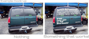
If you drive your vehicle often, why not have an extremely affordable custom window lettering decals on on the tailgate of your truck or rig, or even applied to your back windows. The following article describes tips, tricks, and ideas that work, put together based on my real life experiences and experimentation in the sign industry, a cumulative span of more than two decades.
Almost free. It’s that good. Simplified branding tactics and advertisement that works.
Personally, I’ve found that the more I drive, and more importantly, if the advertising decal is catchy and clear, I get sales and more so perhaps, branding and exposure when I have succinctly stated and clear advertising vinyl decals on my vehicles back window glass or lower panels.

I’ve been designing vinyl decals for over twenty years now, and I make it a point to keep a close eye on my competition–just by looking at other vehicles! I see many that have gone wrong, and have at times even approached the business owner, offering a simple fix. Here are some TIPS for back-window, lower panels, or tailgate decals, as well, but to a slightly lesser degree of exposure in traffic, door and side panel decals, that will boost your sales and exposure.
- Make sure all necessary information on the decal is clearly visible from a distance. This is the number one fault I see with vinyl graphics vehicle advertising. People want it flashy, with shadows and other distracting effects, at a sacrifice to clear and crisp visibility. You must make sure the information is large even with easy to read fonts or you’ll sabotage your efforts, and only those small few that happen to be parked right behind your vehicle at the stop light will be able to read your information as it will be essentially buried under it’s own bling.
- Use colors that POP, but also think of contrast. Applying to a back window with tinted glass? Well, white decals have 100% contrast, ie. black to white is a full spectrum shift. Thinking of applying red decals instead? Or even worse, blue decals to tinted glass? Well the contrast is less, probably by around 50% with red, and blue, we won’t go there. Less contrast might usually be okay, but if you’re driving at night and need the most visibility then the simple white on black will stand out a lot more. How much more: about 50%! In darker and dimly lit conditions, even rain, the red decals will be less visible.
Then use an outline of another color you might say… But that takes us back to number one. We need simplicity in a world of chaos, at least and especially for the vinyl lettering itself. We want these decals to be visible for the maximum distance. How far? More than 6 car-lengths, and if you ask me, more than twenty! Not a believer, take a look on your drive to work today and see which advertisements you can actually read from a far away. No cheating–don’t tailgate! - Sometimes, simple is better. Graphics all over the place, do you have tons of images? Potential-client’s eyes will be dancing about their sockets. Many times, in the short amount of time needed to take down the information, they’ll get lost looking for your contact information, or worse, what it is that your even do. Yeah, it might look like a driving kaleidoscope, but will your graphics, especially the text, catch the client when it comes down to what matters.
Here’s a recent, personal example. I saw a mobile car-wash, Chevy minivan the other day while driving back from Durango, Colorado. It was wrapped–probably costing the owner a small fortune–with graphics everywhere, a wish-wash of soap bubbles, maybe even a dude holding a pressure-washer wand, but I could not read the text! I was driving at about sixty miles per hour, so I couldn’t safely get any closer than about 6 car lengths, and I recall being interested, but as hard as I tried I couldn’t get the important information; it was relatively small, and on the bottom of the back door, buried within the soap and bubbles, and there was the text shadow options and whirly fonts that made it just that much more difficult. So, I decided to try something. He was driving a tad slow and when I had he chance I passed. Driving by at the speed necessary to overtake the van in my Dodge 2500, I attempted to read his advertisements. Well, I had surmised (yes, I actually had to guess) correctly, through the vague plaster of a wrap–that it was in fact a mobile car wash service, but there was no way to read the information.
“Lore,” I said to my wife in the passenger seat. “Take down that info…” She couldn’t see it. The font was just too difficult to read. And I knew, had he put some large, clear, and bold one-color vinyl text on the back windows, perhaps apart from the soapy wonderland, I would’ve been giving him a call later, perhaps.
So, large, clear, and easy to read from the greatest distance possible–statistically the result will pay off big over the long term. - Less information is better, because most potential clients DO NOT have a photographic memory! For example, I never recommend including two phone numbers on your layout. One is enough! Nobody jots down two! Also, really think about what information you do need to add. Do you need the address? Do you need a full and complete list of each and every service you offer?
More to take in, especially while driving, is less. Put only the most important information on your advertisement decals and graphics. In a day where, perhaps, attentions spans are shorter than ever, as well there is more clutter jamming the highways, more signs, more everything, you want yours to stand out, but trying too hard, well, statistically that can backfire. What I have found to be most effective: Business name, a catchy one hopefully, as well one that’s short, a captivating catch phrase. Then, one phone number, and next on the importance list is a website address that can be easily read and remembered quickly–one that hopefully you rank in the search engines for because a tiny spelling glitch when your prospective client enters the address into the browser–an address bar that now searches in all browsers–well, they will end up finding your competition, rather than you. And finally, only if needed, because you can and should already have it on the web page, the address. If needed it is okay to list a few services, not your entire repertoire! - Spending big bucks, isn’t always necessary! Now we know that simple can be better–clear, crisp, allowing potential clients the ability to jot down your info in a relatively quick moment. Simple, short, catchy phrases work best. And, I recommended standard die-cut decals over fancy printed wraps many times. But why? Well, for one, the cost, it’s much, much cheaper, and the durability is the same or better when quality materials are used. Full Intensity Grafx uses quality 6-year Oracal vinyl, which has proven itself for decades.
Now what to do about all this? Take a step and decide to add this small cost-effective improvement to your business. Be it a small home-based business, an eBay store, or just a website you want to promote–do you drive enough to make it worth it? Likely. Or does your vehicle sit in a location, a busy parking lot, near traffic on the roadside, then a small $20 to $40 window lettering decal could pay for itself. *Cost varies.
Back window lettering decals drive a boost in sales.
So on your drive to work today take a look around and see which are catching your eyes, and from how far away. Want to go fancy on something for your own business, show promotion, event–the sky’s the limit–then head on over and take a look at what Full Intensity Grafx has to offer. Order online automatically DIY, or contact me, John, for a personal touch. We ship daily and in no time at all you could have a basic, or elaborate, custom lettering vinyl decal working for you with no maintenance needed for years to come!

Hi there,I check your new stuff named “Back window lettering decals. Drive your way to a boost in sales in decals! – Full Intensity Grafx” regularly.Your story-telling style is awesome, keep it up!
I like this webb blog so much, saved to bookmarks. Awesome Decals!
Greetings! Very useful advice in this particular article! It is the
little changes that will make the biggest changes.
Many thanks for sharing and great decals!
I don’t normally comment but I gotta admit thanks for the post on this amazing one. Quick question. Can decals be applied to wood surfaces?:
Amy.